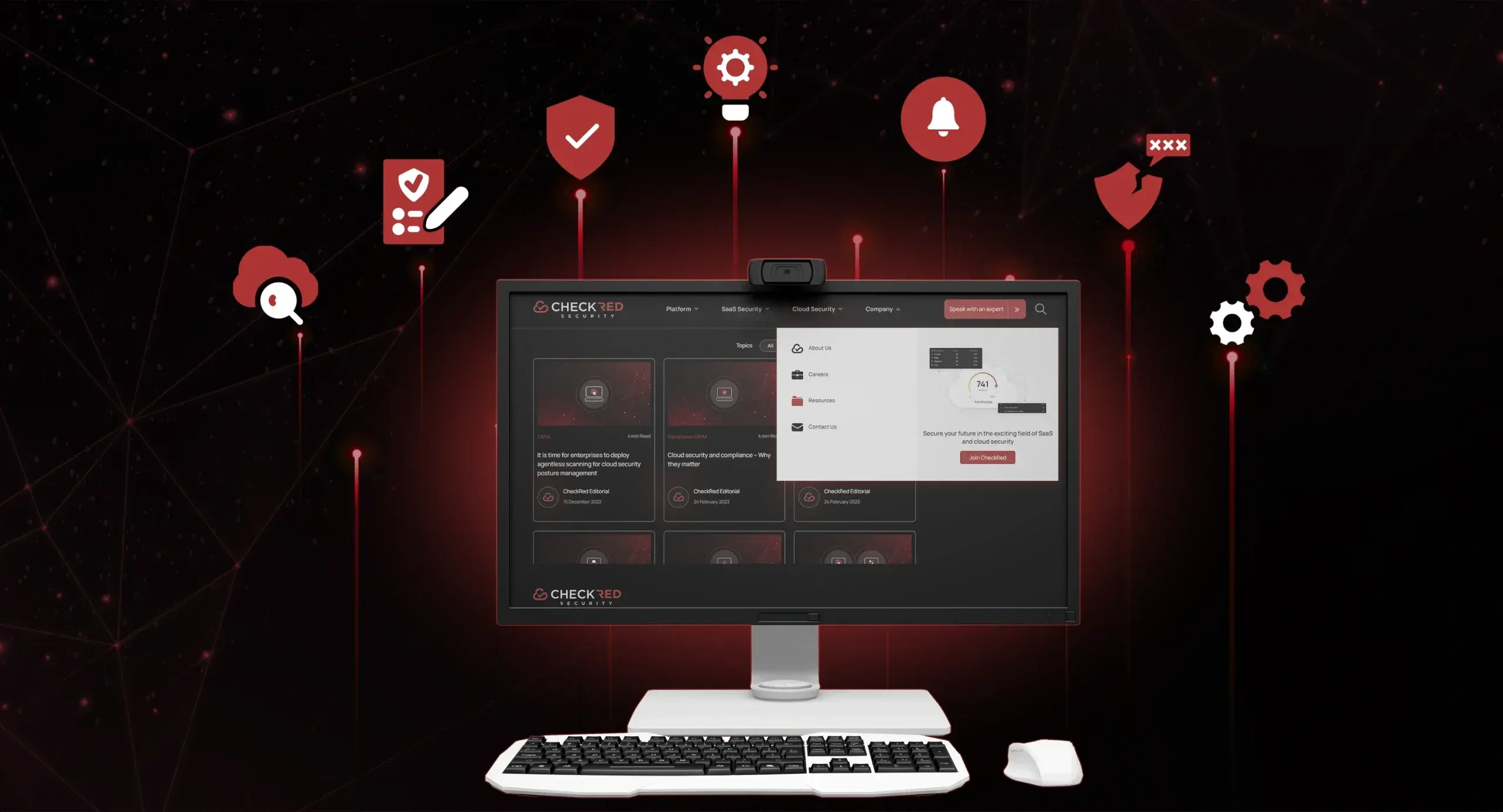
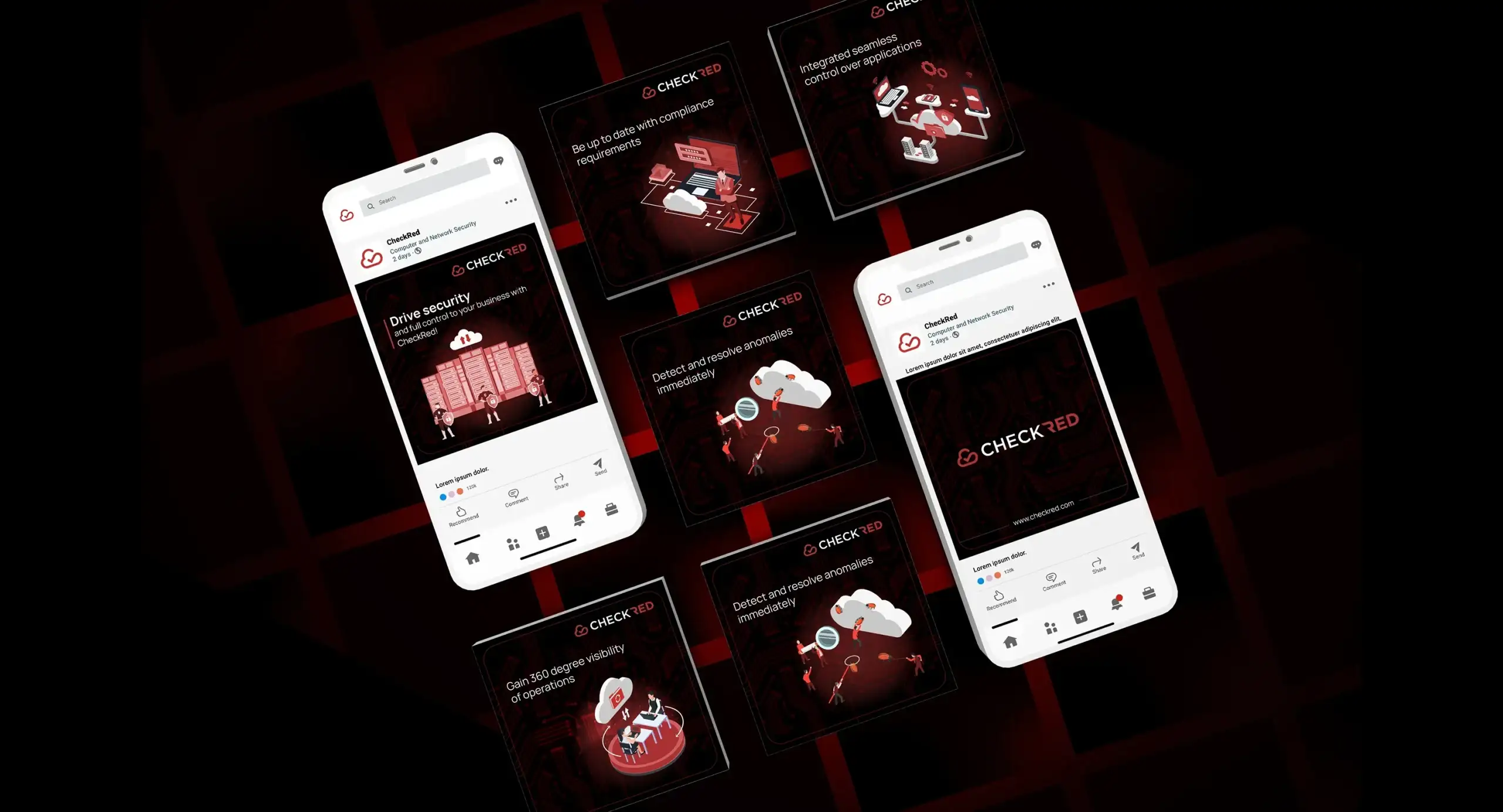
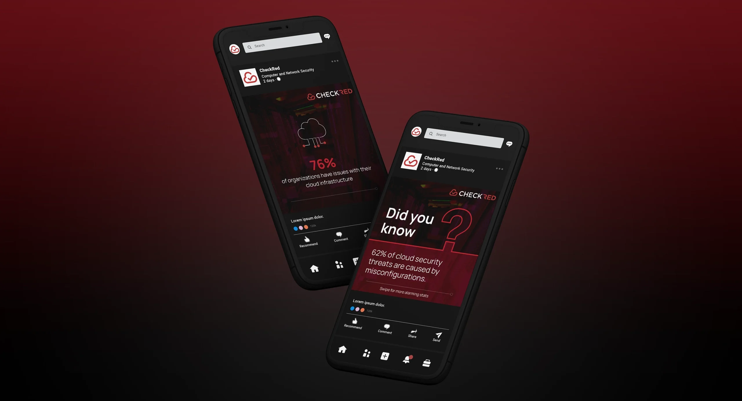
Bold Design, Distinctive Look: CheckRed's Revamped Website
CheckRed provides an all-in-one SaaS and cloud security solution that simplifies the process of securing cloud environments for enterprises. Their SSPM and CSPM approach offers a centralized and user-friendly security solution that covers major cloud providers and over 50+ SaaS apps, providing unparalleled visibility into security posture. Their goal is to empower organizations to confidently navigate the cloud and focus on growing their businesses.
Problem statement- Challenge :
In order to outpace the competition posed by established players in the field of cloud and SaaS security, our client aspired to establish a unique and distinctive presence for themselves. This strategic move was undertaken with the objective of gaining
a competitive edge and staying ahead of the curve.
To achieve this, they sought to elevate the standards of their existing website and create a comprehensive knowledge bank for the domain. They understood that content was paramount to building a solid reputation in the industry and, therefore, focused on creating high-quality and informative resources that could assist enterprises in navigating the complexities of cloud security.
Strategy and approach :
Our team conducted a detailed analysis of the domain and the competitors' websites before designing a website that met the industry standards while accurately conveying the client's vision and brand identity. We undertook extensive research on the domain to create compelling content that established our client as a thought leader in the industry. Moreover, we ensured seamless communication with various stakeholders across multiple demographics to guarantee complete client satisfaction.
Highlights :
We recognized that our client's target audience comprised high-level decision-makers in the field who expected nothing but the best. Since the competition had already been operating in the domain for around three years since our client entered the market, we conducted thorough research and analysis to create detailed and comprehensive content that positioned our client among the big leagues. Our focus on providing high-quality and in-depth resources established the client as credible and authoritative players in the industry, ultimately enabling them to capture the attention and admiration of their target audience.
Vajra’s value addition- Solution :
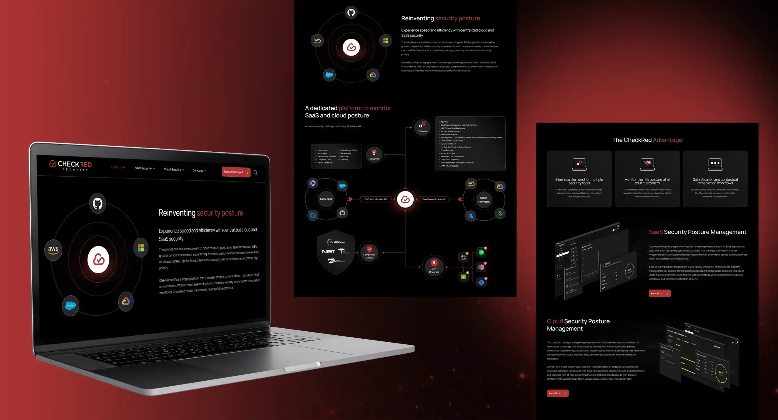
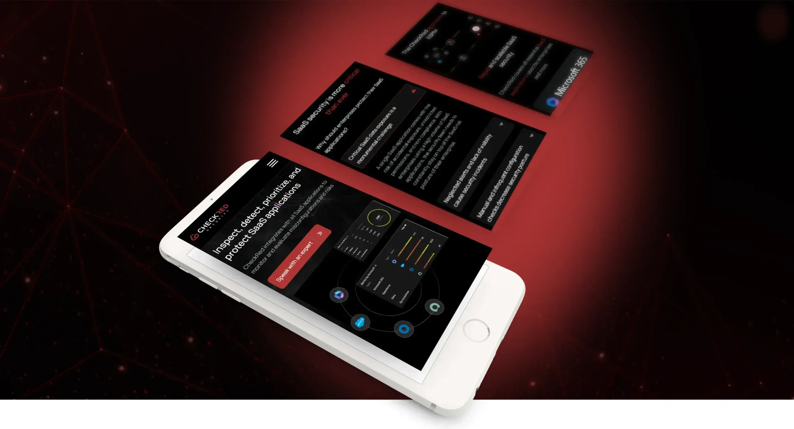
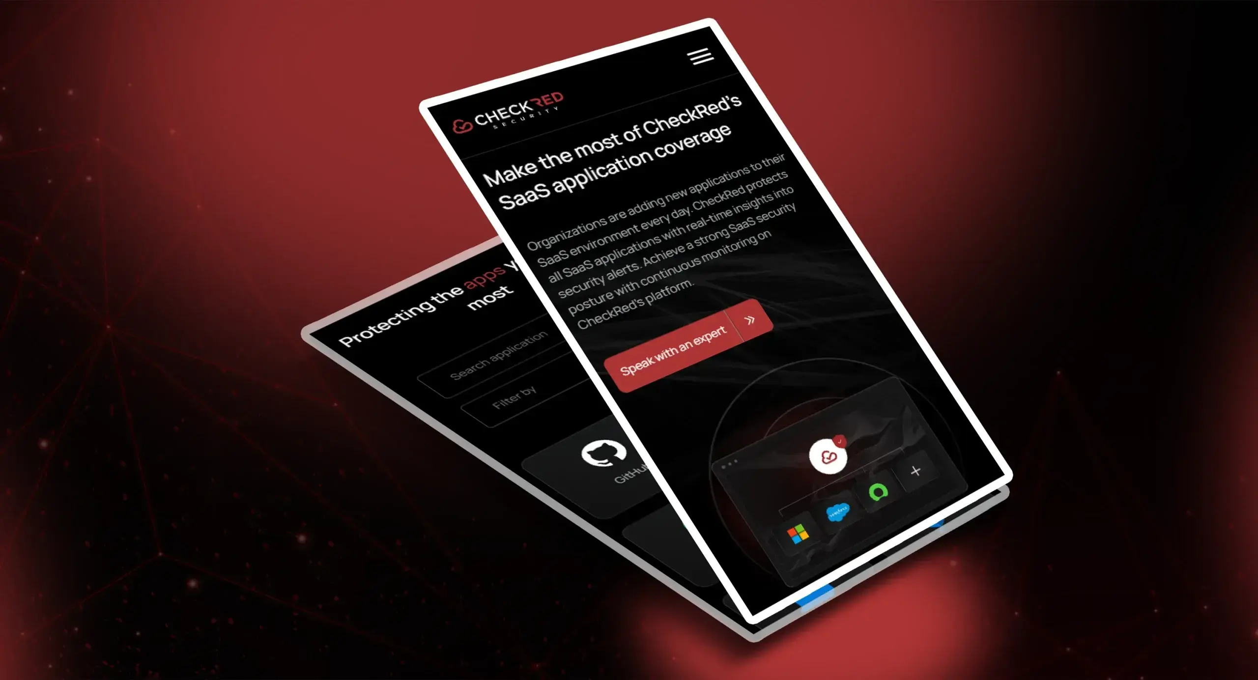
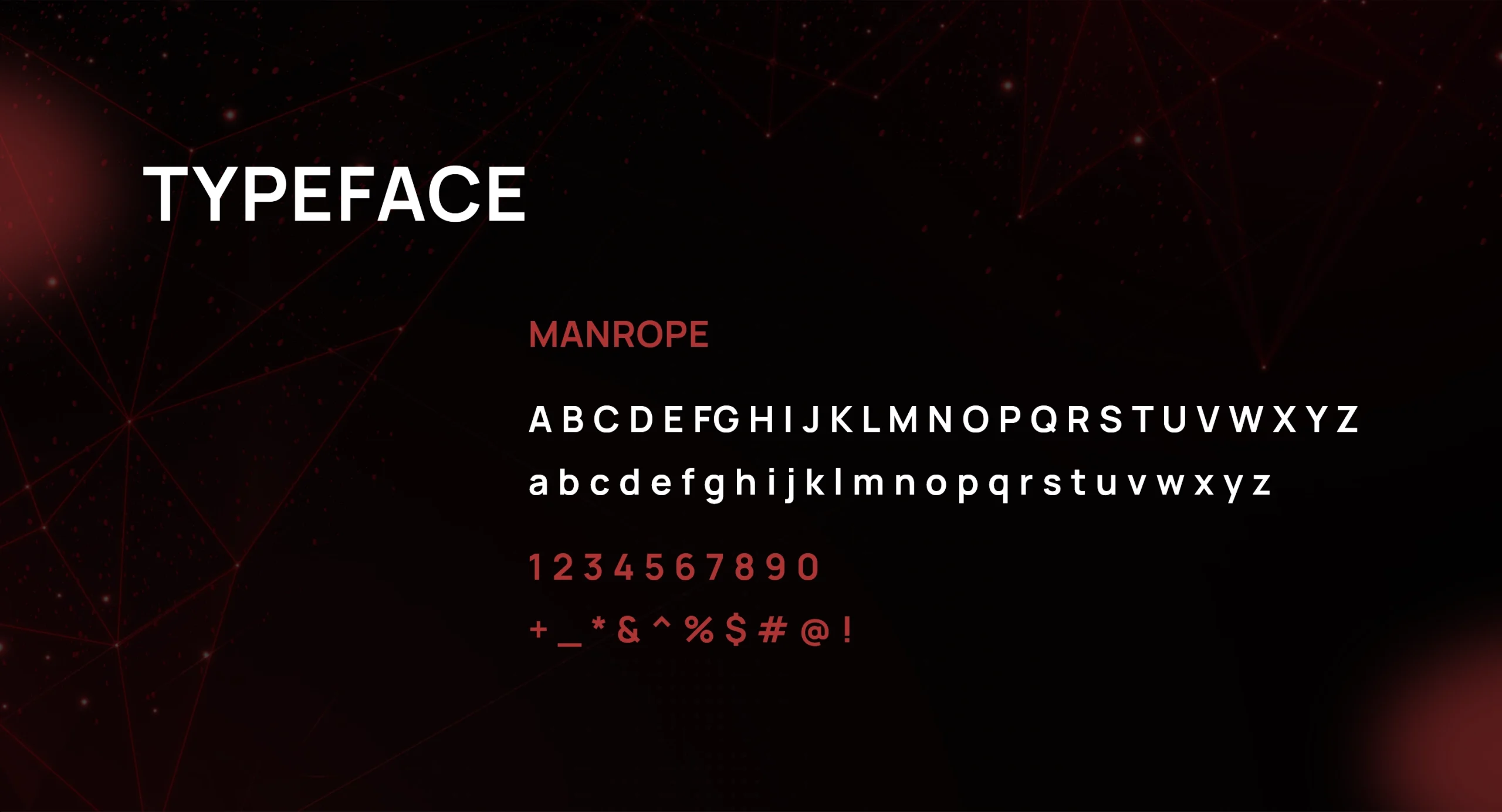
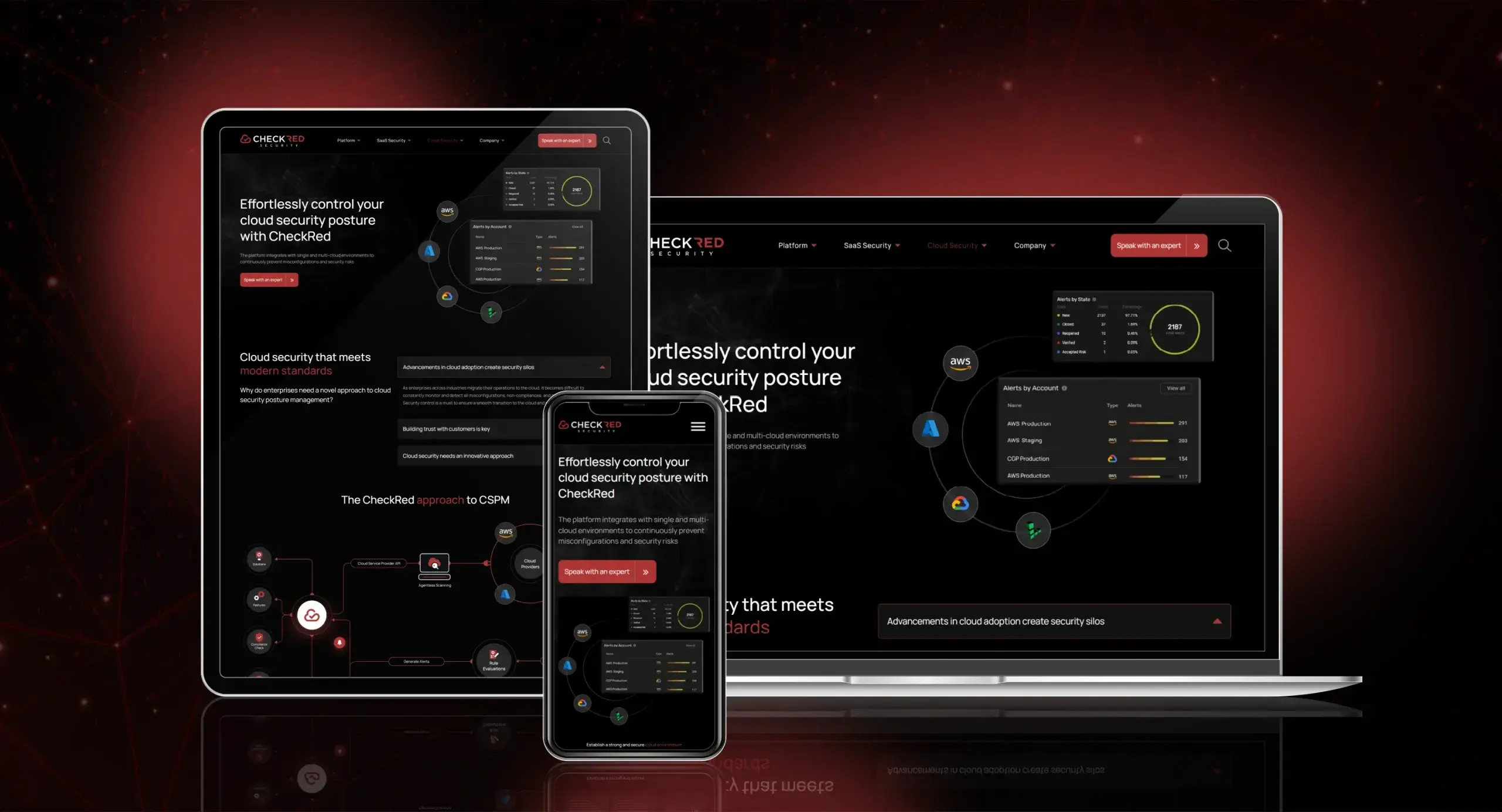
Our team completed an overhaul and upgrade of the client's website, resulting in a modern, interactive user experience that felt professional and high-end. We deviated from the general color theme of green, white, and blue used in the industry and opted for a bold choice of red and black, giving the website a unique and distinctive look. We paid meticulous attention to every detail, from the backdrop to the hover animations, to ensure that the client's theme was incorporated in a unique way. Moreover, the website contained highly detailed content related to the domain, which the audience found informative and valuable. The client was delighted with the outcome, and we received appreciation for our promptness and attention to detail, all while delivering within the agreed timeline.
Last line/End line :
Attention to Detail and Promptness
